


RESEARCH QUESTION AND HYPOTHESIS
As cities grow larger, average travel distances to destinations of interest increase. In response, growing cities’ structures might transition from monocentric to polycentric (destination activities concentrating in a few points in the city) or dispersed (destination activities not concentrating and assuming a more scattered form) (Louf and Barthelemy 2014; Pfister, Freestone, and Murphy 2000). Polycentric cities are normatively seen as a desirable urban form, since they can likely provide travel-distance benefits if travel behavior in a region is organized so that residents travel mostly to their closest center.
Travel data describe the organization of activities across a metropolitan area, and thus track their centricity structure. If a region is polycentric, the standard assumption is that only a few geographies will show positive net inflows (inflow–outflow), especially for data on work commutes. But we hypothesize that such a clear signature on polycentricity is not easily seen. Increasingly multimodal transport systems and evolving economies and workforces suggest that the polycentric model might be unrealized as workers move around the city in ways not well-captured by traditional models and data sources.
In this article we investigate the empirical evidence on the above hypothesis and test whether centers are consistently defined across data sources.
METHODS AND DATA
We examine two datasets:
- Transit journey-to-work (JTW) data for the metropolitan region of Sydney at the Statistical Area Level 2 (SA2) geography definition for 2016 from the Australian Bureau of Statistics (ABS).
- Transit smartcard data (Opal card transactions from April 5, 2017) for the metropolitan Sydney region, aggregated to the SA2 geography definition.
The geography considered is SA2s in Sydney, Australia, which are larger than suburbs but smaller than functional metropolitan labor markets. The SA2 region was chosen because it is the finest consistent area definition for which a full origin–destination table is available from the ABS. To make the datasets comparable, both were limited to public transit commute trips: the journey-to-work data was limited to only trips completed on public transit and the smartcard data was limited to trips that occurred in the morning peak (7:00 a.m. to 9:00 a.m.) and were repeated at least three times that week. All trips are aggregated into two origin–destination matrices at the SA2 level, one each for each dataset.
The subsets of the data are designed to allow comparison of like with like. Since only work commutes are available in the ABS JTW data and only transit trips are available from Opal card transactions, we consider the intersection of transit commutes. Trip purpose is not recorded in smartcard data, so repeated a.m.-peak trips are used as a proxy for commute trips. Therefore, commutes that occurred once or twice per week, commutes that occurred three or more times per week but not on April 5, 2017, commutes that occurred outside the a.m.-peak period, and commutes during which the traveler used more than one card or varied their boarding or alighting stop are not included. This resulted in a smartcard dataset that is substantially smaller than the journey-to-work dataset, as evident in Figure 1a and Table 1. As described below, the difference in scale is accounted for by working with the rank of the center rather than the inflow itself. The requirement of the a.m.-peak departure time is a potential source of bias as it emphasizes traditional “nine to five” monocentric commute patterns that may be evolving away.


A second principal difference between the two datasets arises from a counting principle. The JTW data considers “usual residence” as the origin point. Thus, the number of trip origins are counted from a respondent’s place of usual residence. The smartcard data, on the other hand, counts tap ins and outs. Thus, the number of trip origins as per the smartcard data is aggregated up to the SA2 level from the station or stop levels. If someone lives in one SA2 but walks and catches the train or bus from the nearest station or stop in another SA2, it would change the counts for the number of trip origins measure between the smartcard and the JTW data somewhat. However, as mentioned above, treating these data differences as noise, we have worked with ranks rather than actual inflow numbers.
Further comparisons of the two datasets are discussed near the end of the Findings section.
The research aims to calculate a flow-based centricity measure using the two datasets and compare the results.
Centricity, Ck, is defined as the net inflow for zone k:
Ck=I∑i=1Ti,k−J∑j=1Tk,i
where Ti, j is the total number of trips originating in zone i and ending in zone j. If a region is divided into n small zones, then each zone serves as an origin as well as a destination. Centricity is defined as the number of people coming into a destination zone minus the number of people flowing out of the same origin zone, and regions with higher inflow are centers.
The SA2s are ranked by centricity (net inflow) for each dataset, with the smallest rank given to the center with the highest net inflow. While the centricities go from positive net inflow to negative net inflow (indicating net outflow), the ranks go from 1 to n, where the largest rank corresponds to the place with the highest net outflow. Regardless of scale, the ranking indicates the relative importance of each SA2 as an employment center. The Opal smartcard and census JTW rankings are compared using Spearman’s ρ rank correlation coefficient. This coefficient varies between -1 (perfect inverse correlation) and 1 (perfect correlation), and values around 0 indicate weak correlation. The null hypothesis of the test is that the two ranks are not correlated, and the p-value indicates the probability of observing these rankings if the null hypothesis is true.
This article’s research question asks whether different measures will yield consistent results about the organization of activities in general and about the location and importance of centers specifically. Anti-centers, or sources, in the system (places with net outflow/negative inflow) describe the residential organization of workers, while centers or sinks (places with net positive inflow) describe the organization of principal destinations in the system. Therefore, for this study, centers (high net inflow) are more interesting than anti-centers (high net outflow), although we study and report on the entire range of places. Accordingly, rank correlations are tested as a function of sample size, x, where the correlation values are reported by considering the ranks of the x most important centers and then gradually increasing x to n. This tests the hypothesis that centers above a certain threshold of importance are well defined (and therefore will show high correlation values between both datasets), but different data sources or approaches might yield inconsistent results for less centric geographies (and hence correlations will go down as the number of centers increases and those of higher ranks are considered). Dispersed urban form would be implied by marginal net inflows for most SA2s and weak correlation between the ranks from the two datasets.
FINDINGS
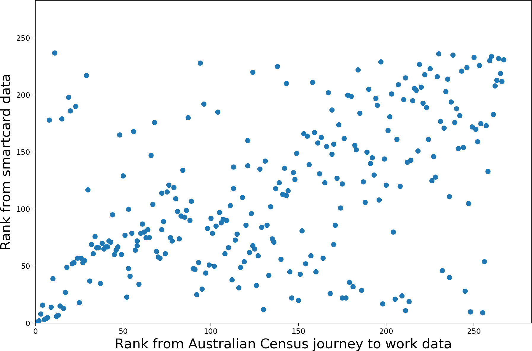
The comparison of the two datasets is shown in Figure 1. The inflow values tend to be higher for JTW data, and many SA2s are clustered around zero for both datasets, indicating that as many trips enter as leave for public transit commutes. The plot highlights that the most important center, the historic-traditional Central Business District (CBD) Sydney–Haymarket –The Rocks, has an inflow roughly 10 times larger than the next most important center, North Sydney–Lavender Bay. In part, this reflects that the system was designed to serve and therefore reinforce a strong CBD. The comparison of ranked centricities (Figure 1b) shows correlation, particularly for very high- or very low-ranked SA2s.
The rank correlations are compared with Spearman’s ρ, yielding a coefficient of .51, rejecting the null hypothesis (H0: uncorrelated ranks) with high probability (p < .001).
Starting with only the most important centers, Spearman’s test is repeated for increasingly large samples. As suggested by Figure 1b), the correlation is strongest for the most important centers. By the middle of the rank, the correlation is weak (.3) and volatile. Correlation increases toward the bottom of the rank as the anti-centers (those with substantially more outflow than inflow) also show correlation. This relationship is illustrated in Figure 2. The SA2s with the highest and lowest JTW net inflows are shown in Table 1 to illustrate the strong scaling between the datasets and correlation in the extremes.
There is also corroboration between the two datasets when proportions of trips attracted by the top five centers are compared. Both datasets describe only transit commutes, yet the top five centers have only 59% of trips (142,839/241,953) in the smartcard data and 60% (299,369/502,854) in the JTW data. This suggests that a substantial number of transit commutes occur outside of the traditional top centers.
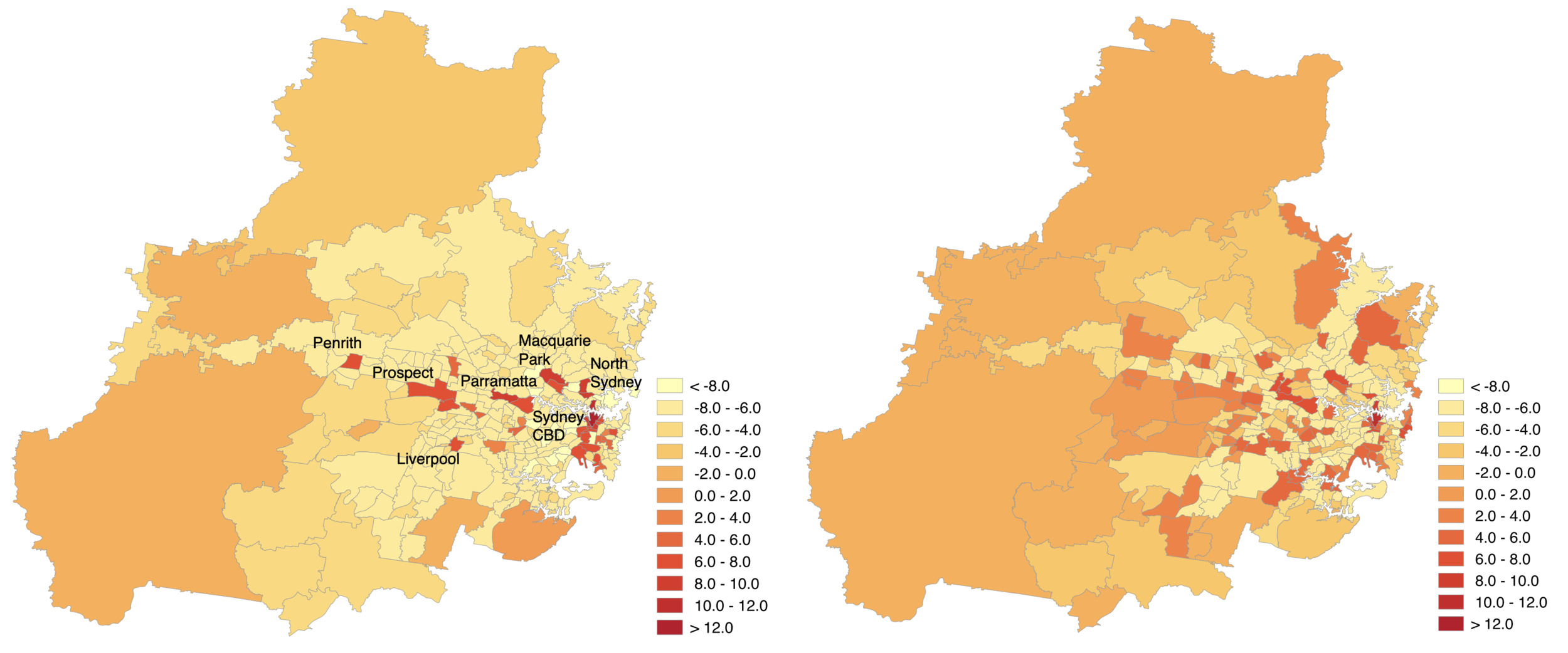
The finding also highlights that two datasets designed to capture public transit commutes show only weak correlation for most SA2s. This is a caution against considering the centers universal; the organization of activities in a region may be more dispersed than existing urban theories such as central place theory suggest (Sarkar, Wu, and Levinson 2019). Most noticeably, four of the top five centers are spatially clustered around the traditional historic CBD, and only one center (Parramatta–Rosehill) is near the west of Sydney, separated by a significant distance from the traditional CBD. The inflows from the two datasets are compared spatially in Figure 3 to show this concentration around the CBD. Both datasets support the hypothesis that a traditional monocentric city form has not turned into a polycentric form, but instead into a dispersed form for the rest of the region, with the monocentric center still dominating. Applying centricity methodologies across scales and different data sources may reveal more about the datasets than the cities. One such example is the discrepancy of Surry Hills shown in Table 1. Surry Hills is in walking distance to Central Station (located in the traditional CBD, Sydney–Haymarket–The Rocks), so the smartcard dataset would misattribute trips during which the traveler accessed Central Station by foot rather than by bus.
This finding shows that centricity is consistently defined between datasets for the most important urban centers and anti-centers. However, the net inflow for all except the Sydney–Haymarket–The Rocks SA2 represents a small fraction of the total travel taking place. In fact, the spatial adjacency of four of the five most important SA2s indicates a monocentric model with over 40% of transit commutes to dispersed destinations, which reflects the legacy of a CBD-focused transit system design. Although the centricity shown in the inset of Figure 1a naively suggests polycentricity, the spatial confluence of the top centers, in addition to inconsistencies in the middle-ranked centers supports a monocentric-plus-dispersed model instead.
ACKNOWLEDGMENTS
The authors thank David Levinson for early discussions and feedback.