
1. Research Questions
The objective of this research is to compare travel time data obtained from Google API and from Uber Movement data. There have been studies utilizing Google Distance Matrix API (Wu 2017; Wang and Xu 2011; Seymour, James, and Miller 2007), Tom-Tom data (Owen and Levinson 2015), and to date few if any using the recently released Uber Movement data. These crowd sourced data provide considerably more temporal and areal coverage than conventional data collection efforts, but the quality of data, and the consistency between different sources can be difficult to verify. This research seeks to answer the questions:
- Are these crowd sourced data, and studies based on such data sources reliable?
- To what extent do the data sources matter?
2. Methods and Data
Google’s Distance Matrix API and Uber’s Movement data are both crowd sourced data that provide travel time estimates. Automobile travel time estimated by both sources incorporate traffic conditions that vary by time of the day. Google API allows customizing trip origin and destinations, travel time estimates are based on routes that minimize travel time. Google does not officially disclose methods used for predicting travel times; it is believed that crowd sourced GPS data from Google Maps users on Android and iPhones, road types and speed limits are used depending on local availability, algorithms constantly calibrate predicted travel time using observed data to fine-tune future travel time predictions. According to Uber (Uber 2018), their travel time data is based on actual trip data when Uber vehicles are carrying passengers. Uber’s Movement data are based on GPS time stamps and aggregated to Destination Zones (DZNs)(Uber 2018), which does not conform to the Australian Statistical Geography Standard (ASGS), but can be aligned to the Census Statistical Area Level 2 (SA2).
The study area covers all 312 SA2s within the Greater Sydney region. Google Maps API travel times are predictions for 8 am, on Wednesday, June 13, 2018; Uber movement data is based on 7-9 am throughout 2017, and include 3.6 million records. We use automobile travel time matrices between SA2 centroids (Greater Sydney area) to compare the two data sources. Centroids of SA2 are used as trip origins and destinations for the Google API.
The travel time matrix from Uber’s data average DZN level trips to obtain travel times between larger SA2 level travel times. It is possible that such practice would sway the actual trip centroids in the Uber data towards the direction of where more trips take place (i.e. activity centers).
Close locations have more trips between them, thus lowering the overall travel time compared to using geometrical centroids. Boundaries between destinations zones have changed between 2011 and 2016. In aggregating the Uber movement data to 2016 SA2s, such changes in DZN boundaries cannot be accounted for, thus minor errors within the Uber SA2 travel time matrix are expected. It is likely that trips between SA2 centroids overstate the actual inter-zonal distance (and thus time), as, following Tobler’s Law, near places are more likely to interact than far places.
We obtained a 312 by 312 SA2 level travel time matrix from the Google API data, including inter-zonal trips. The Uber travel time matrix is limited by its sample size and includes 22,043 inter-zonal trips, or 22.72% that of the Google travel time matrix. Travel times that are available in both Google and Uber’s travel time matrix are used for comparison.
3. Findings
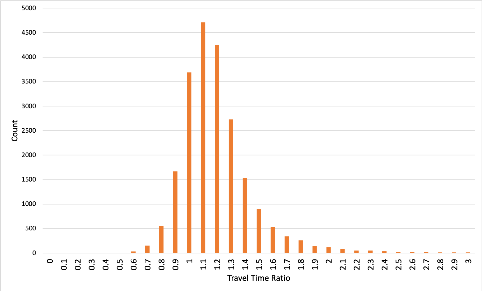
Travel time observations from Uber’s data are systematically lower than Google’s predictions. Average travel time ratio (Google/Uber) between the same set of locations is 1.262, and 99.6% of the ratios are distributed between “0” and “3”. Figure 1 shows the distribution the ratio, excluding outliers.
Figure 2 shows the distribution of travel time ratio. The distribution is generally bell curve-shaped, with a heavier tail towards higher travel time ratio.
(boxes_span_25th_to_75th_percentile__whiskers_extend_to_max.png)
.png)
We find the travel time predictions by Google systematically higher than the travel times recorded by Uber. It is possible that Uber drivers are more experienced than the general population in finding the most efficient route, and drive faster. Since Uber’s data collection only takes place when the vehicle is carrying passengers, Uber drivers have the incentive to complete the trip using the shortest possible time. Actual Uber trips are likely shorter than centroid-to-centroid, so aggregation upward may be biased. Biases in Google’s data collection, the inclusion of non-travel related time (such as picking up children, drive-through at a restaurant) may have contributed to the longer travel time predicted by Google. Methods used in aggregating trips from DZNs to the SA2 level may also reduce Uber Movement-based travel time estimation.
Differences in travel time predictions may also be attributable to the intent of data providers. Google’s travel time data is intended to provide guidance for travelers, which may contain some ‘buffer time’ to improve user satisfaction. On the other hand, Uber’s travel times are not speculative, but aggregated raw data.
Findings from this study suggest that travel time from Google and from Uber are generally similar, and studies based on such data are potentially valid in their own context. Comparison of results from different studies must first validate differences in their data sources.