Loading [Contrib]/a11y/accessibility-menu.js
Skip to main content
null
Findings
  • Menu
  • Articles
    • Energy Findings
    • Resilience Findings
    • Safety Findings
    • Transport Findings
    • Urban Findings
    • All
  • For Authors
  • Editorial Board
  • About
  • Blog
  • covid-19
  • search

RSS Feed

Enter the URL below into your favorite RSS reader.

http://localhost:22663/feed
Urban Findings
November 19, 2022 AEST

An Online Interactive Dashboard to Explore Personal Exposure to Air Pollution

Won Do Lee, Kayla Schulte, Tim Schwanen,
Air pollutionPersonal exposureDashboardsGeoprivacySmart-sensing devices
Copyright Logoccby-sa-4.0 • https://doi.org/10.32866/001c.49875
Photo by Sidharth Bhatia on Unsplash
Findings
Lee, Won Do, Kayla Schulte, and Tim Schwanen. 2022. “An Online Interactive Dashboard to Explore Personal Exposure to Air Pollution.” Findings, November. https:/​/​doi.org/​10.32866/​001c.49875.
Save article as...▾
Download all (2)
  • Figure 1. Representations of NO2 levels during individual travel trajectories for participants (left, where line thicknesses illustrated the measured level of pollutant concentration) and for the public (right).
    Download
  • Figure 2. Personal exposure profiles as shown to study participants (left) and the public (right).
    Download

Sorry, something went wrong. Please try again.

If this problem reoccurs, please contact Scholastica Support

Error message:

undefined

View more stats

Abstract

Studies increasingly examine individual exposure to air pollution while accounting for person-specific activity-travel patterns. Supporting policymakers and local communities using the resulting data requires transparent and ethical communication of exposure levels to affected individuals and other stakeholders. This paper asks how an interactive online dashboard might represent individual-level air pollution exposure profiles to different audiences while respecting individuals’ geoprivacy. Using data from 37 Oxford (UK) residents, it shows that heterogeneous individual-level exposure profiles can be shared ethically through different combinations of visualisation method, spatial and temporal resolution of data representation and Geomasking techniques for different dashboard user groups.

1. Questions

Concern about social and spatial inequalities in air pollution exposure and health burdens within populations has prompted researchers to explore exposure during travel and out-of-home activities. Studies are increasingly estimating individual exposure to air pollution using advanced methodologies that can account for the person-specific, dynamic nature of daily activities and travel (Ma et al. 2020; Park and Kwan 2017; Poom, Willberg, and Toivonen 2021). We too have recently generated personal exposure profiles using time-stamped, geo-tagged air pollution data for inhalable (PM10) and fine particulate matter (PM2.5), and Nitrogen Dioxide (NO2) for a sample of 37 participants from Oxford, UK. Data of this nature can support policymakers and local communities involved in environmental governance (Özkaynak et al. 2013).

Additionally, transparent, ethical communication of individual-level exposure data to affected individuals and associated stakeholders has yet to be achieved (Ramírez et al. 2019). This study proposes an online dashboard as an effective medium for such communication, helping to pivot air pollution governance away from reliance on 24-hour or longer-term averages and towards addressing what drives variation and inequality in pollution exposures over space and time. However, the introduction of such a dashboard raises the challenge of geoprivacy: how to respect “individual rights to prevent disclosure of the location of one’s home, workplace, daily activities, or trips”? (Kwan, Casas, and Schmitz 2004, 15). This paper, therefore, addresses the following question: how might an interactive online dashboard represent individual-level air pollution exposure profiles to different audiences?

2. Methods

We collected data on individuals’ daily activity-travel patterns and air pollution exposure using activity-travel diaries, personal air quality monitoring equipment (PAQME) and GPS equipped sensors. 37 individuals based in Oxford, England, participated in the study. Each participant carried a GPS tracker and PAQME for one week and completed an online active-travel diary via a secure web portal at the end of each day. This approach was adopted to confirm the validity of personal daily trajectories. A database compiling individual daily trajectories and time-stamped air pollution measurements was used to estimate individual-level air pollution exposure. Travel routes were connected to street networks using transport mode-specific open route services. The R package osrm (Giraud et al. 2022) was used for private vehicle, walking and cycling routes, and OpenTripPlanner for R (Morgan et al. 2019) for public transport (bus) routes.

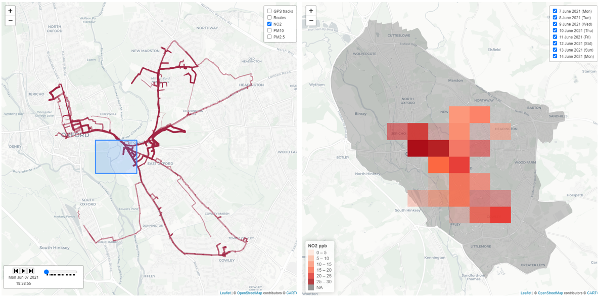
An interactive online dashboard to explore individual-level exposure to air pollution has been developed using the flexdashboard package for R Markdown (Sievert et al. 2022). Air pollution concentrations along selected routes are illustrated using the interactive visualisation feature uses leaflet package (Cheng 2022) . The colour of markers corresponds to the pollutant selected, with inhalable particulate matter (PM10 and PM2.5) shown on a scale of cyan to green and Nitrogen Dioxide (NO2) in reddish-brown. The interactive pollution concentrations graph feature uses the plotly (Sievert 2020) package to depict pollutant emissions at specific dates/times.

We have deployed two techniques to respect individuals’ geoprivacy. From available Geomasking techniques for the anonymisation of individual-level data (see Kounadi and Resch (2018) for a review), we use the Geohash technique to aggregate points into areal units (Fox et al. 2013). Geohash length 6 is used to display individual travel-activity trajectories as grid areas (1.2km x 609.4m). Geohash was selected because it is a public geocoding system that encodes location data coordinates into alphanumeric string grid cells using geohashTools for R (Chirico 2020). Furthermore, we designed different access control rules for three categories of user types: researchers, participants, and the public (Table 1). This configuration helps researchers to share appropriate information with different user groups.

Table 1.Online dashboard platform designs for different user types.
For researchers
(Administrators)
For participants
(Standard user accounts)
For the public
(Limited user accounts)
Purpose Estimating personal exposures from ambient air pollution measures through (generated) personal exposure profiles among multiple participants Exploring personal exposure profiles aggregated by ordered sequences of activity-travel episodes Monitoring how levels of air pollution have changed over time across space
Access levels Complete access to database, and control over dashboard configuration Full access to their collected individual data, but limited control over the dashboard platform Limited access to the de-identified information about air pollution exposure, which is aggregated to averages per hours of the day across all study participants
Travel routes GPS tracks and travel trajectories as lines Travel trajectories as lines Grid aggregations
(squares) created through Geohash tools
Pollution measurements Individual exposure profile by pollutant concentrations measured Pollutant concentrations measured with the number hours of air quality standard (or guidelines) are exceeded Pollutant concentrations measured and contrasted with air quality data from static monitoring sites nearby (i.e., UK Automatic Urban and Rural Network as air quality monitors)
Spatial resolution Geographic location at a certain precision Personal daily trajectories at the street segment level Grid cells constructed by implemented Geomasking technique (e.g., geohash grid aggregation)
Temporal resolution Every minute for each of seven days Averaged to hour of the day for each of seven days Averaged to each hour of the day across the seven days (no disaggregation by day of the week)

3. Findings

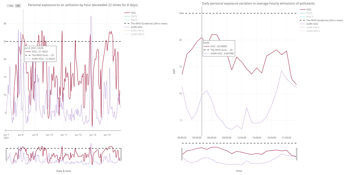
The dashboard interface (https://wondolee.github.io/JFF) presents patterns in daily exposure to PM10, PM2.5 and NO2 at different resolutions for different user groups (Table 1). All user groups see three linked displays: on the left a map of Oxford, and on the right a graph with (average) measured pollutant concentrations over the diurnal cycle plus a bar to adjust the time window for which exposure levels are displayed. Study participants are offered full access to their own data (Figures 1a, 2a).[1] In contrast, to protect participants’ geoprivacy, maps and graphs for the public depict how individual-level exposure data aggregated into grid cells and averaged to each hour of the day and across the seven days (Figures 1b, 2b).

To facilitate comparison and examination of health risks that air pollution exposure poses, the graphs in Figure 2 show additional information. First, a trend line indicating pollution concentrations measured at the official UK Automatic Urban and Rural Network (AURN) monitoring station in Oxford’s city centre at St Ebbes street (ID: UKA00518) is depicted. Secondly, the WHO guideline for the 24-h mean NO2 value of 25μg is included (see also Table 2). The differences between PAQME generated air pollution measurements and AURN monitoring station data reflect differences in spatial position, and potentially the larger margin for error associated with PAQME measurement. PAQME generated measurements are best considered indicative of experienced exposure because the performance of low-cost portable sensors can vary under different urban conditions (Lewis and Edwards 2016; Ma et al. 2020). We nonetheless believe that using of such sensors is acceptable when the aim is to convey information on patterns of exposure and induce reflexivity about when and where action to reduce exposure might be considered.

Figure 1
Figure 1.Representations of NO2 levels during individual travel trajectories for participants (left, where line thicknesses illustrated the measured level of pollutant concentration) and for the public (right).
Figure 2
Figure 2.Personal exposure profiles as shown to study participants (left) and the public (right).
Table 2.Guidelines for the assessment of health effects of ambient air pollution by WHO and UK government.
Organisations PM2.5 PM10 NO2
WHO Air Quality Guidelines 20213 Annual 5 µg/m3 15 µg/m3 10 µg/m3
24-⁠hour mean 15 µg/m3 45 µg/m3 25 µg/m3
UK Air Quality (Standards) Regulations 20104 Annual 25 µg/m3 40 µg/m3 40 µg/m3
24-hour mean - 50 µg/m3
(no more than 35 exceedances in a single year)
200 µg/m3 (1-hour mean)
(no more than 18 exceedances in a single year)

3 The WHO Air quality guidelines (AQG) 2021 recommended levels and interim targets for common air pollutants; PM2.5, PM10, NO2, and O3. It released on 22 September 2021 (https://www.who.int/news-room/feature-stories/detail/what-are-the-who-air-quality-guidelines).
4 The Air Quality Standards Regulations 2010 transpose into English law – please see Limit values in Schedule 2 (https://www.legislation.gov.uk/uksi/2010/1001/schedule/2/made)

In short, the developed online dashboard can disseminate and exchange variations in air pollution exposure safely by tailoring permission levels to different audiences with advanced de-identification techniques. It paves the way for customisable advice about individual-level air pollution exposure reduction by allowing individuals, citizen collectives, NGOs and policymakers to engage with (their own) daily activity-travel patterns in meaningful ways that preserve Geoprivacy. For instance, it can provide targeted insight for to help active transportation users seeking to reduce total exposure during their commuting or when travelling along main roads during peak hours, if dashboard is regularly updated.


ACKNOWLEDGEMENTS

This research is part of the ‘Personal air pollution exposure assessment using smart sensing technologies’ project (reference: 0008971), funded by the University of Oxford’s John Fell Fund.


  1. Map (Figure 1a) and graph (Figure 2a) for study participants were generated by using author’s data to protect Geoprivacy of participants’.

Submitted: July 19, 2022 AEST

Accepted: November 08, 2022 AEST

References

Cheng, Joe. 2022. leaflet. https:/​/​github.com/​rstudio/​leaflet.
Google Scholar
Chirico, Michael. 2020. geohashTools. https:/​/​github.com/​MichaelChirico/​geohashTools.
Google Scholar
Fox, Anthony, Chris Eichelberger, James Hughes, and Skylar Lyon. 2013. “Spatio-Temporal Indexing in Non-Relational Distributed Databases.” 2013 IEEE International Conference on Big Data, 291–99. https:/​/​doi.org/​10.1109/​bigdata.2013.6691586.
Google Scholar
Giraud, T., R. Cura, M. Viry, and R. Lovelace. 2022. osrm: Interface Between R and the OpenStreetMap-Based Routing Service OSRM. https:/​/​github.com/​riatelab/​osrm.
Google Scholar
Kounadi, Ourania, and Bernd Resch. 2018. “A Geoprivacy by Design Guideline for Research Campaigns That Use Participatory Sensing Data.” Journal of Empirical Research on Human Research Ethics 13 (3): 203–22. https:/​/​doi.org/​10.1177/​1556264618759877.
Google ScholarPubMed CentralPubMed
Kwan, Mei-Po, Irene Casas, and Ben Schmitz. 2004. “Protection of Geoprivacy and Accuracy of Spatial Information: How Effective Are Geographical Masks?” Cartographica: The International Journal for Geographic Information and Geovisualization 39 (2): 15–28. https:/​/​doi.org/​10.3138/​x204-4223-57mk-8273.
Google Scholar
Lewis, Alastair, and Peter Edwards. 2016. “Validate Personal Air-Pollution Sensors.” Nature 535 (7610): 29–31. https:/​/​doi.org/​10.1038/​535029a.
Google Scholar
Ma, Jing, Yinhua Tao, Mei-po Kwan, and Yanwei Chai. 2020. “Assessing Mobility-Based Real-Time Air Pollution Exposure in Space and Time Using Smart Sensors and GPS Trajectories in Beijing.” Annals of the American Association of Geographers 110 (2): 434–48. https:/​/​doi.org/​10.1080/​24694452.2019.1653752.
Google Scholar
Morgan, Malcolm, Marcus Young, Robin Lovelace, and Layik Hama. 2019. “OpenTripPlanner for R.” Journal of Open Source Software 4 (44): 1926. https:/​/​doi.org/​10.21105/​joss.01926.
Google Scholar
Özkaynak, Halûk, Lisa K Baxter, Kathie L Dionisio, and Janet Burke. 2013. “Air Pollution Exposure Prediction Approaches Used in Air Pollution Epidemiology Studies.” Journal of Exposure Science & Environmental Epidemiology 23 (6): 566–72. https:/​/​doi.org/​10.1038/​jes.2013.15.
Google Scholar
Park, Yoo Min, and Mei-Po Kwan. 2017. “Individual Exposure Estimates May Be Erroneous When Spatiotemporal Variability of Air Pollution and Human Mobility Are Ignored.” Health & Place 43:85–94. https:/​/​doi.org/​10.1016/​j.healthplace.2016.10.002.
Google Scholar
Poom, Age, Elias Willberg, and Tuuli Toivonen. 2021. “Environmental Exposure during Travel: A Research Review and Suggestions Forward.” Health & Place 70 (April):102584. https:/​/​doi.org/​10.1016/​j.healthplace.2021.102584.
Google Scholar
Ramírez, A. Susana, Steven Ramondt, Karina Van Bogart, and Raquel Perez-Zuniga. 2019. “Public Awareness of Air Pollution and Health Threats: Challenges and Opportunities for Communication Strategies To Improve Environmental Health Literacy.” Journal of Health Communication 24 (1): 75–83. https:/​/​doi.org/​10.1080/​10810730.2019.1574320.
Google ScholarPubMed CentralPubMed
Sievert, Carson. 2020. Interactive Web-Based Data Visualization with R, plotly, and shiny. Chapman and Hall/CRC. https:/​/​doi.org/​10.1201/​9780429447273.
Google Scholar
Sievert, Carson, Richard Iannone, J. J. Allaire, and Barbara Borges. 2022. flexdashboard: R Markdown Format for Flexible Dashboards. https:/​/​pkgs.rstudio.com/​flexdashboard/​.
Google Scholar

This website uses cookies

We use cookies to enhance your experience and support COUNTER Metrics for transparent reporting of readership statistics. Cookie data is not sold to third parties or used for marketing purposes.

Powered by Scholastica, the modern academic journal management system