

1. Questions
The TransitCenter Equity Dashboard[1] is a database and interactive visualization platform detailing monthly transit accessibility[2] and equity measures for the areas of Boston, Chicago, Los Angeles, New York City, Philadelphia, San Francisco-Oakland, and Washington D.C. from February 2020 onward. We developed this database and platform to investigate the following questions:
-
How does transit accessibility vary within these cities, between population groups, with constraints on fares, and over time?
-
How do transit service changes, like those undertaken in response to the COVID-19 pandemic, affect transit accessibility and equity in these cities?
2. Methods
The database includes primal and dual measures of transit accessibility (Cui and Levinson 2020), which quantify the ease with which people can reach valued destinations by transit, as well as measures of transit service intensity and transit reliability.[3] Other multi-region comparisons use similar measures and methods (Allen and Farber 2019; Wu et al. 2021).
Primal measures, which count cumulative opportunity access in a given amount of time are estimated for total jobs, low-wage jobs, and greenspace. Dual measures, which calculate the time to reach the closest or 3rd closest destination are used for healthcare facilities, grocery stores, and post-secondary institutions. Travel time to the closest opportunity is especially meaningful for destinations where choice is likely to be less important (e.g., hospitals or urgent care facilities). On the other hand, travel time to the 3rd closest opportunity can better capture accessibility to destinations where choice matters. For example, situations where different locations are likely to differ substantially in terms of their characteristics or services offered, like grocery stores. Transit service intensity measures the 24-hour average unique transit trips per hour that visit stops within 200 meters of an area. Table 1 lists the opportunities considered in the database.
Each of these measures is evaluated in each region for multiple time periods (weekday morning peak, weekday evening, weekend morning), travel modes (fare-constrained transit, fare-unconstrained transit, auto), and dates (monthly from February 2020 through February 2021, periodically from February 2021 onward). Measures are estimated at the block group level and summarized across each region by population group.
Transit travel times between census block groups in each region are estimated using OpenTripPlanner (OTP) (OpenTripPlanner Contributors 2016) using General Transit Feed Specification (GTFS) data from each region and OpenStreetMap. Auto travel times are estimated using ArcGIS Network Analyst (ArcGIS Pro 2.7) and the ESRI Streetmap Premium network using HERE data (HERE Technologies 2020) to represent typical road traffic conditions based on a process adapted from Higgins (2019). Census block groups provide a reasonable scale for estimating accessibility and walk-to-transit access time to and from census block group centroids is included in the travel time calculations. Further research could consider the effect of using finer spatial units on calculated access scores.
To provide a comparison of fare-constrained and fare-unconstrained transit trips, fares are estimated by first using OTP to generate detailed transit itineraries for the shortest trip between all census tracts in each region. These itineraries are passed to a fare calculator[4], which estimates the cost of each itinerary using a database of manually calibrated rules representing fare information and agreements across multiple transit agencies in the same region. The fastest transit travel time between each pair of tracts in the region and its accompanying fare is then estimated for two different transit networks: one that includes only “low-cost” modes (local bus plus comparable-cost modes) and the other including all modes (all available public transit options). When determining the fare-constrained travel time between two locations (e.g. jobs reachable subject to a $5 total fare), we select the shortest of the two travel times that meets the fare constraint.
The dashboard also includes transit reliability measures that represent the on-time performance of transit vehicles, calculated as the fraction of vehicles that are between 1 minute early and 5 minutes late. Transit reliability is included for transit operators that report the status of vehicle delays in their real-time GTFS feeds.
Viewing and analysis of the results is implemented via an interactive web visualization platform built using open-source Python and JavaScript tools. Web mapping is done via Leaflet (Agafonkin 2011), and the population-weighted summary charts for individual regions are produced dynamically using the data visualization library D3 (Bostock 2012). Primal access measures are colored in quantile bins by block group score; dual measures are colored in fixed bin intervals.
3. Findings
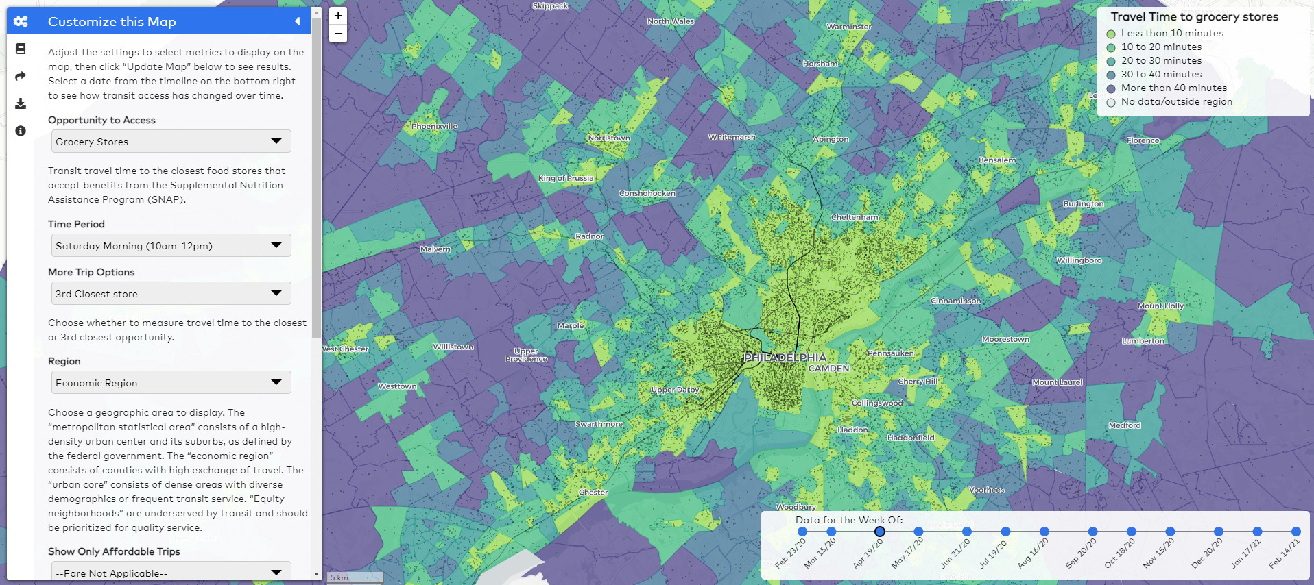
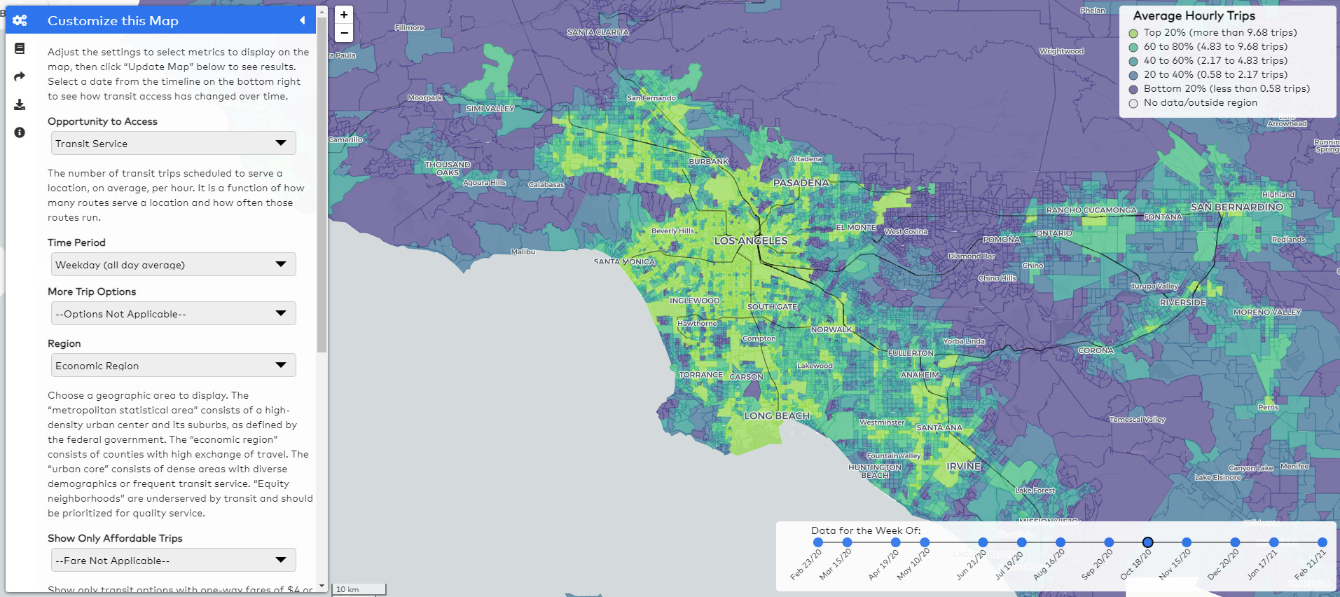
Each region’s mapping application displays the spatial distribution of relative transit accessibility. These maps provide insights into the relationship between transit infrastructure, land use, density, and access and facilitate comparisons between populations and neighborhoods in a region. A user can visualize the effects of density, transit, and the spatial distribution of various socioeconomic groups on transit accessibility at the same time. For example, Figure 1 illustrates how a viewer can compare the spatial distribution of travel times to grocery stores, major transit lines, and the location of essential workers. In Figure 2, transit service intensity across the entire region and multiple agencies can be visualized and inspected by agencies and advocates to identify areas with less transit service. The mapping platform allows visitors to customize which data to view, including access measures, date, time of day/week, region subset, fare restrictions, and comparisons with automobile access.
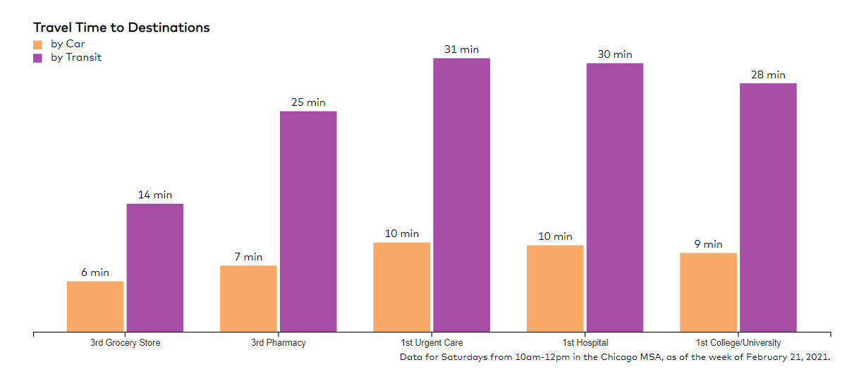
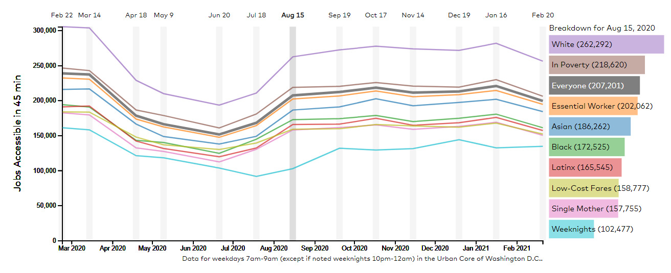
Each region also has a story page containing dynamic charts with specific measures, allowing users to learn about key accessibility and equity issues in the chosen region. For example, Figure 3 compares population-weighted average travel times to key destinations in Chicago for residents living below the poverty line. It highlights that travel times are substantially longer by transit compared to by auto. A time-series plot of access to jobs over time illustrates the impact of service changes on job access for different population groups in Washington D.C., drawing attention to lower levels of access to jobs by Asian, Black, and Latinx transit riders when compared to white transit riders (Figure 4).[5] The effects of COVID-19 on public transit service in D.C. are also clearly visible in the figure. Other dashboard charts display travel times to hospitals and grocery stores, the impact of fares on the number of accessible jobs, transit service intensity, and reliability where available.


The platform can be used by transit agencies, advocates, decision makers, and residents to identify transit equity issues in their regions and compare across geographical areas. The data shown on the dashboard will be updated periodically so that users can continue to trends and progress. Users can also access data for their own analysis by downloading data shown in the map or posted on each region’s download page. Aside from the auto travel times, all code and data are open source, meaning the majority of the the dashboard can also be reproduced in other regions.
Dashboard available at dashboard.transitcenter.org. Data updates will continue as time and resources allow.
The term accessibility is commonly used in the transportation literature to refer to the ease with which destinations can be reached. It is related to but distinct from the same term often used to describe measures intended to assist people with disabilities.
Additional detail about the methods are available at dashboard.transitcenter.org/methodology
Visit dashboard.transitcenter.org/story/dc#theme-access for an interactive version.