
1. Questions
Intercity bus services in the US comprise a large, decentralized network of private and publicly-funded carriers which serve more passenger trips per year than intercity rail (U.S. Department of Transportation, Climate Change Center 2023). Recently, the Bureau of Transportation Statistics (BTS) launched the Intercity Bus Atlas (ICBA), aimed at providing a comprehensive view of the country’s intercity bus services (Evans et al. 2025). The ICBA consists of two datasets each equivalent to layers of shapefiles: one for routes and one for stops.
Motivated by the same goals, this study introduces the Intercity Bus GTFS (IBG), an original dataset of US intercity bus services stored as a single GTFS feed, including calendar, routes, trips, stops, stop times, and shapes.txt files. The dataset differs from the ICBA as follows:
-
Schedule information is included.
-
A more restrictive definition of “intercity” bus service.
-
Routes and stops are linked.
For ease of mapping and analysis, we also offer a simplified GeoJSON version which includes routes, stops and (rather than full schedules) weekly trip frequencies.
2. Methods
The most critical methodological step was to define what constitutes an “intercity” bus route. We use these criteria:
-
Connects distinct metropolitan areas (excludes suburban/urban commuter services).
-
Tickets can be purchased independently (excludes Amtrak Thruway services that connect between rail trips).
-
Uses over-the-road buses (excludes many rural and tribal services operated with vans or transit buses).
-
Operates regularly most of the year (excludes seasonal/charter services);
These criteria are intended to capture the colloquial meaning of “intercity bus.” Admittedly, this definition is inherently arguable, and the criteria involve judgment calls: e.g., whether a route connects “distinct” metros. For example, in the Supplementary Information, we discuss omitting Ventura County Transportation Commission’s “Intercity” routes.
Candidate routes (and agencies operating them) meeting these criteria were identified from the ICBA, state inventory assessment reports (e.g., KFH Group 2021), ticket aggregators such as https://www.wanderu.com and reports published by the Chaddick Institute at DePaul University.
We obtained each included operator’s route and schedule data from the following sources:
-
GTFS feeds that some operators publish themselves. Their links were found on Transitland (Interline Technologies 2025) and Mobility Database (MobilityData 2025).
-
An online map published by Transcor Data Services (https://maps.tds.ai/map), a technology platform serving the intercity bus industry. The map displays routes for many agencies, and the page that hosts the map sends JSON timetables to the user’s web browser.
-
Manual creation of GTFS files from timetables published on agency websites: e.g., https://peoriacharter.com/schedule for Peoria Charter.
-
Automatic creation of GTFS files by scraping booking pages, such as https://www.redcoachusa.com/. This was only possible for certain sites.
We subjected all data to a complex pipeline of cleaning and validation steps described at a high level in the Supplementary Information. Technical steps, including a Jupyter Notebook, appear on the project’s GitHub repository at https://github.com/UTEL-UIUC/intercity-bus-gtfs. A snippet of the simplified GeoJSON FeatureCollection (suitable for mapping) appears in Figure 1. Note that routes and stops are linked by unique identifiers.
3. Findings
The GTFS and GeoJSON datasets are available at https://github.com/UTEL-UIUC/intercity-bus-gtfs. An interactive ArcGIS map of the dataset is available at https://rb.gy/wcaj18, from which the user can also download shapefiles of routes and stops. Figure 2 shows a map of the IBG. Note that many routes overlap (especially in the Northeast).
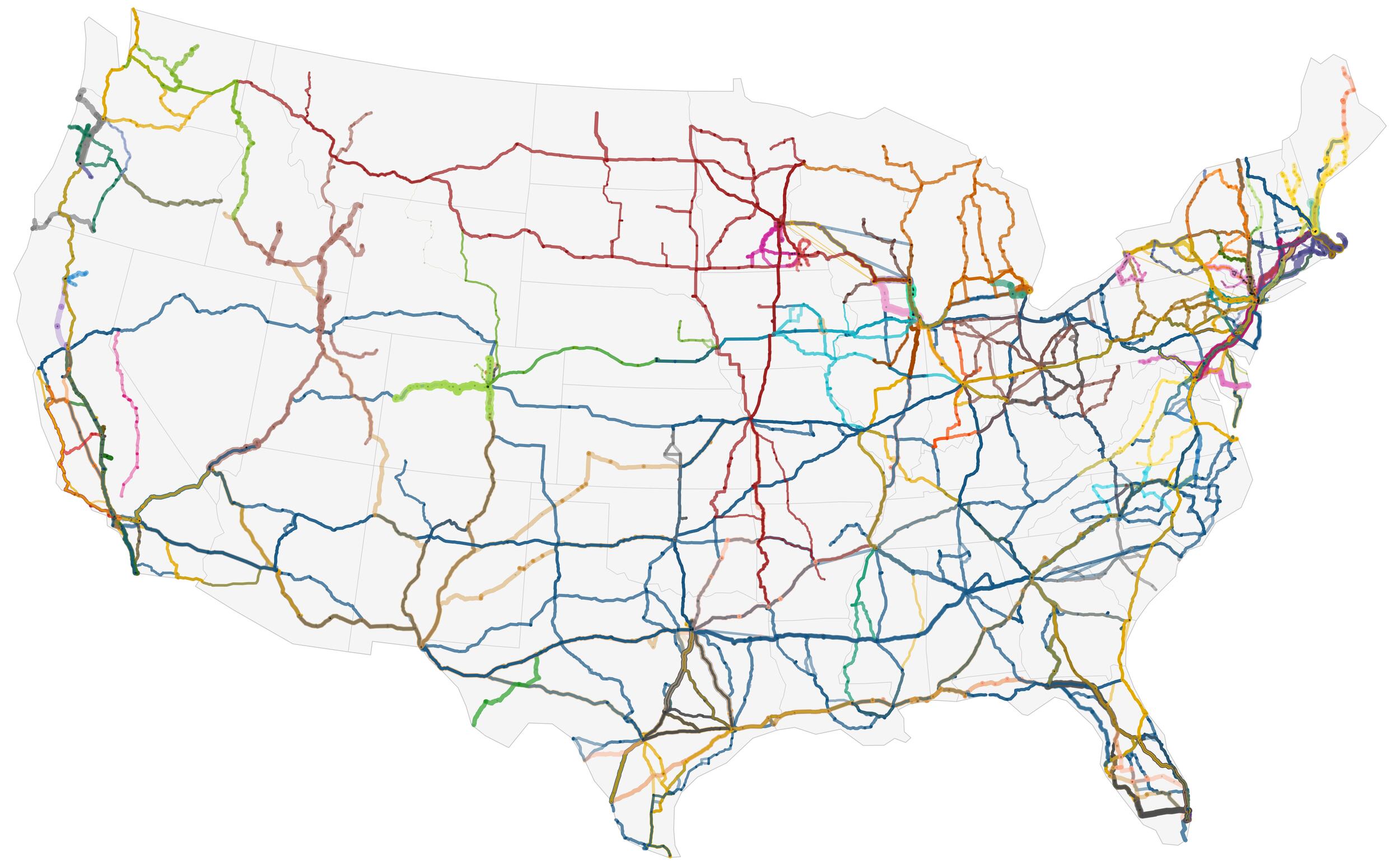
Table 1 compares aggregates from the IBG and ICBA in terms of agencies, stops, and route kilometrage[1]. The ICBA has many more stops and agencies. The difference mainly lies in our more restrictive criteria: e.g., the ICBA includes the entirety of some local transit networks, leading to many more stops.
It is important to note the dataset’s limitations:
-
Some agencies’ (especially so-called “Chinatown” buses) operations proved difficult to ascertain or to encode as GTFS—being ambiguous either in reality or as presented online.
-
It is common for firms to enter or leave the market, or change their routes and schedules, so the dataset is a “snapshot” of a dynamic network rather than a more permanent record like road or rail networks. Currently, all data were collected in 2025. The authors plan to update the dataset at regular intervals.
-
The data sources contain “unknown unknowns.” For example, GTFS feeds sometimes have broken route shapes. We have remedied this in some cases by substituting Google Maps direction queries for the missing route shapes. However, the existence of errors that we did identify implies that there are likely others we did not find and fix.
-
With a local transit service, an agency declares what constitutes a certain “route” and has an official name for it. For intercity bus, the concept of a “route” is more ambiguous, and we have named some routes ourselves when an official name was not provided.
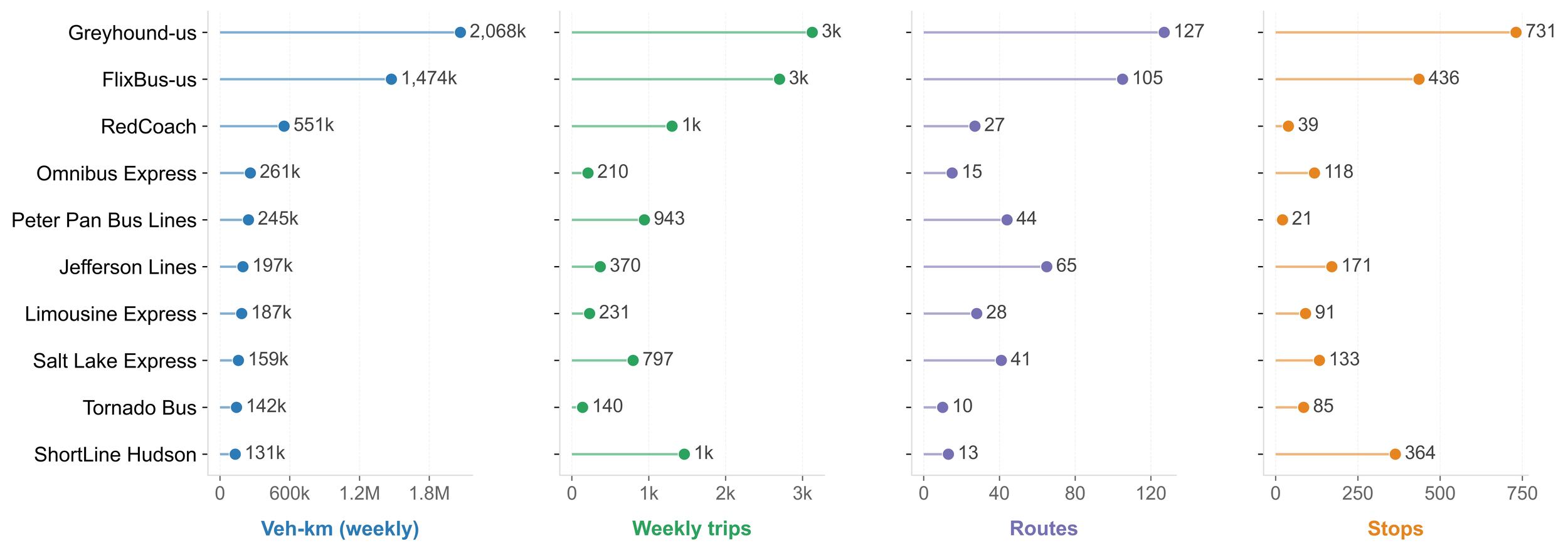
We now present some summary statistics and observations which help to characterize the network captured by the dataset. Table 2 shows the ten most frequent routes. The two most frequent routes are connections to Logan Airport in Boston. Three of the top ten routes are government-provided (by Bustang and Detroit Ann Arbor Express).
Figure 3 shows statistics for the 10 operators with the highest weekly vehicle kilometers (VKM). These ten account for over 6.4 million VKM, with Greyhound and FlixBus contributing nearly half of that. As shown in Figure 3, similar VKM levels can reflect different service patterns. For example, Peter Pan Bus Lines provides approximately 245,000 VKM through frequent service on shorter routes, whereas Omnibus Express delivers a comparable level of VKM using fewer trips over substantially longer routes. Beyond these large carriers, a long tail of regional operators contributes smaller VKM totals that collectively expand geographic coverage. A table of all operators is available in the Supplementary Information. Note that many agencies (operators) are owned by the same parent companies: e.g., Greyhound and FlixBus are owned by Flix SE.
.jpg)
Table 3 shows statistics for the states with the most route-km. The largest states by population (California, Florida, New York, and Texas) have the most stops, but New Jersey has more operators and route-km than Florida. The Supplementary Information includes statistics for all states.
It is hoped that the IBG will prove useful to authorities creating inventories of intercity bus service for purposes of planning and policymaking, as well as to scholars who may use it in future research. Promising research topics include:
-
Assessment of the potential for electric, LNG or other low-emission fuels.
-
The industrial organization and scale economies of the intercity bus market—after the fashion of substantial research in airline markets (e.g., Brueckner and Spiller 1994).
-
The economic geography and regional science of intercity bus networks, as in studies of rail geography (e.g., Jiao et al. 2017).
Route lengths were calculated using dissolved geometries to exclude overlaps.